Filter content by studio:
Boulder Public Library named 2016 Colorado Library of the Year
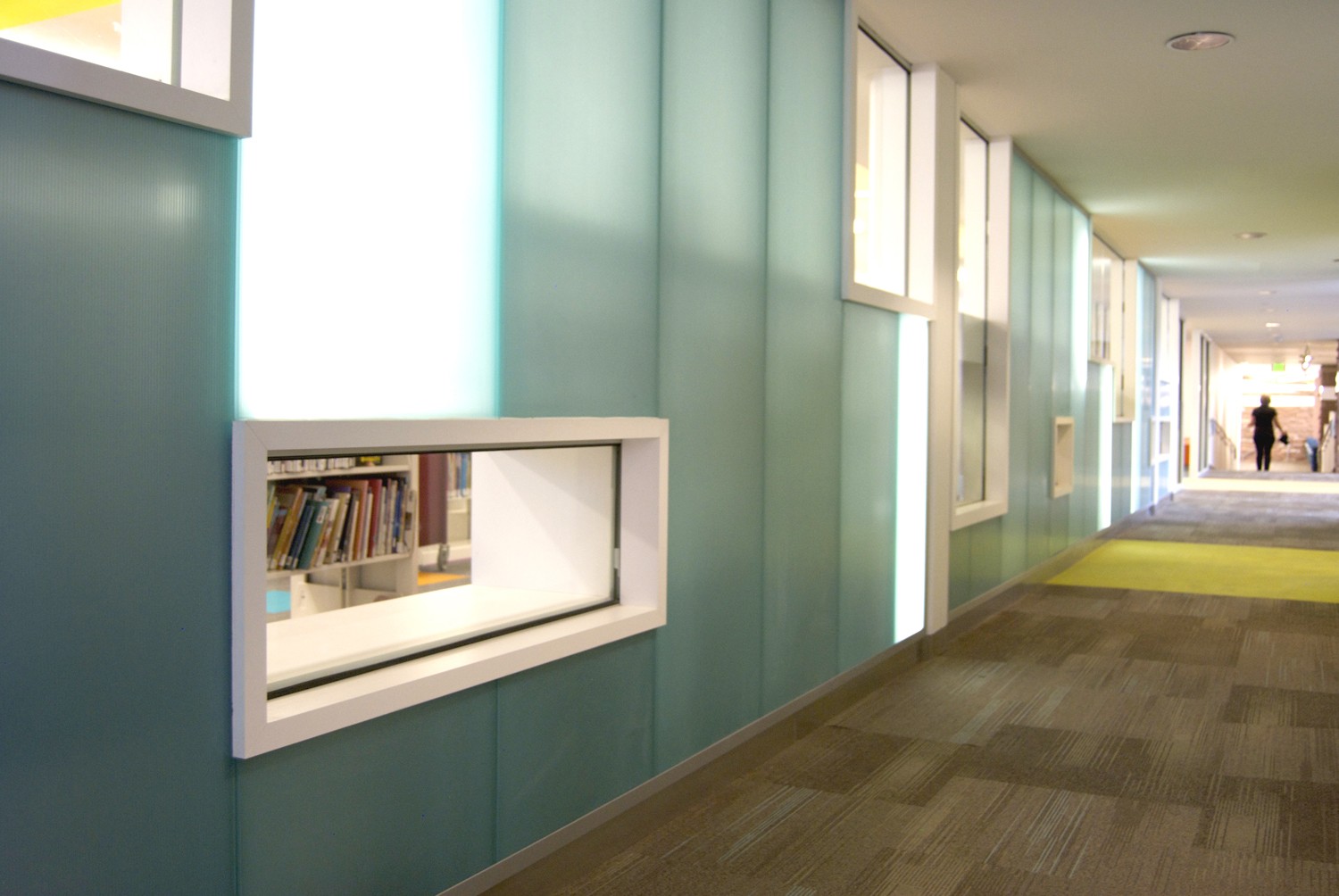
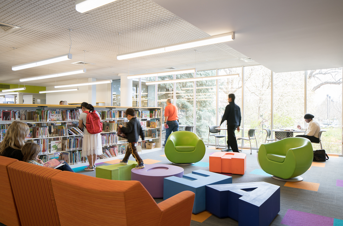
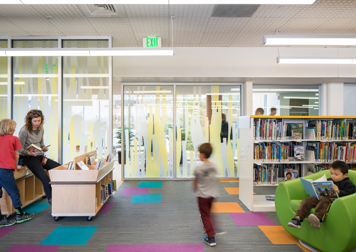
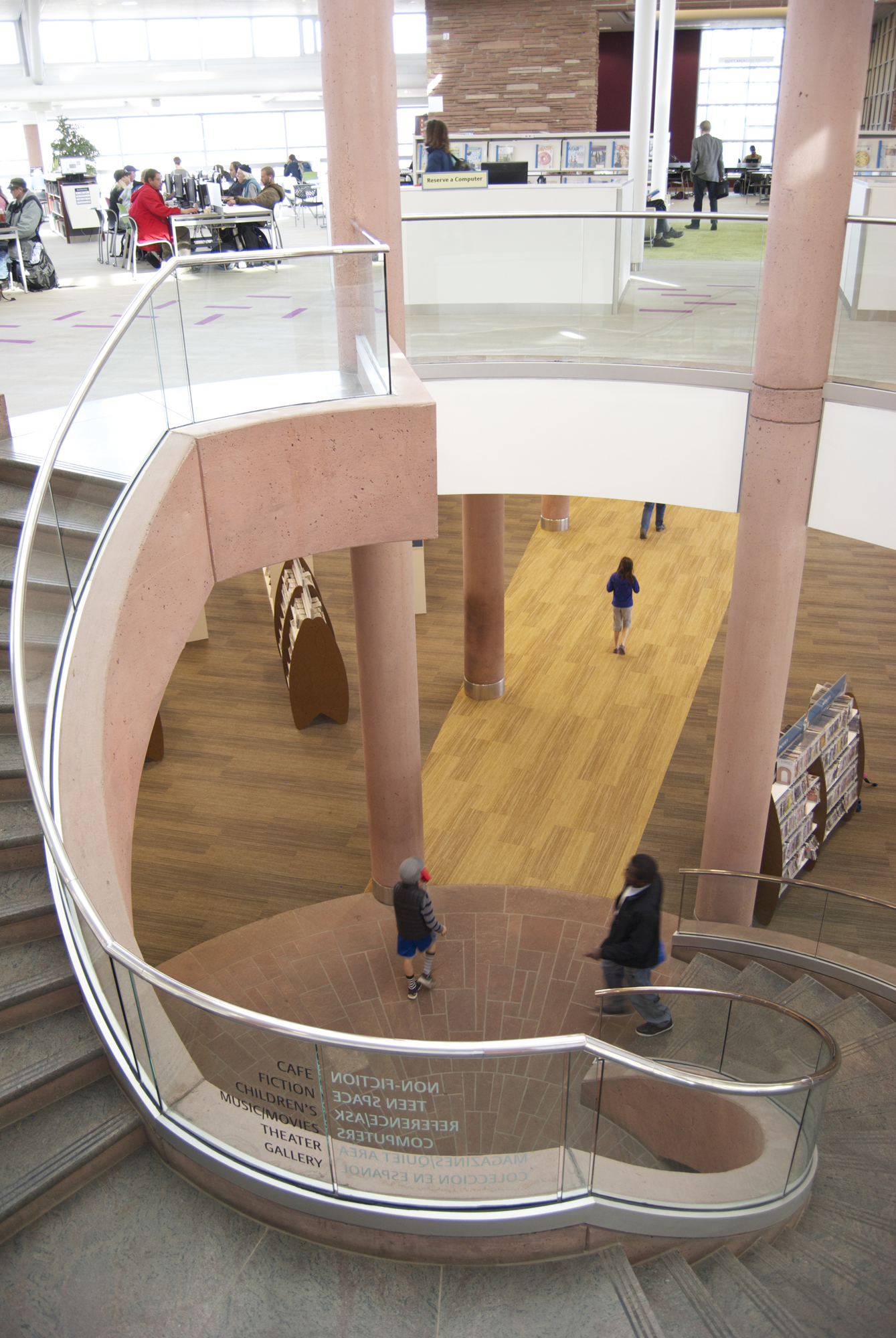
"Stream of Serendipity" is an architectural concept generated for the Boulder Public Main Library after several months of collecting data from the diverse Boulder community and Boulder Public Library staff and administration. The concept driver embodies what Boulder aspires to be, a place of unexpected delightful experiences. The project's goals suggested the Boulder Library could artfully present useful information to those not specifically searching for it. The "Stream" is the conduit for connecting community members with this information and each other. Along the "Stream" a series of Eddies were introduced to capture impromptu social or learning opportunities. More commonly known as meeting rooms, these Eddies are flexible in their purpose and offer variety (size, location, look/feel), thus feeding the imaginative minds of Boulderites and encouraging serendipitous discoveries.
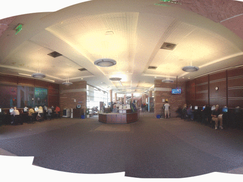
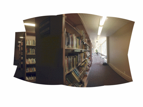
The existing library was difficult to navigate, and contained more hidden pockets than an urban library should. Having significantly expanded more than once over its lifetime, the building complex had many iconic features and unique qualities. It was also somewhat overwhelming, monochromatic, and uninviting in spots. The "Stream" reshaped the overly defined and separated areas into a more cohesive and blended series of experiences. This was accomplished with the introduction of hierarchy, showcased landmarks, improved sight lines, and integrated wayfinding. In the end it was important that Library occupants have a plethora of opportunity to truly connect with each other and their community, all while also successfully accomplishing their particular reason for visiting the building.
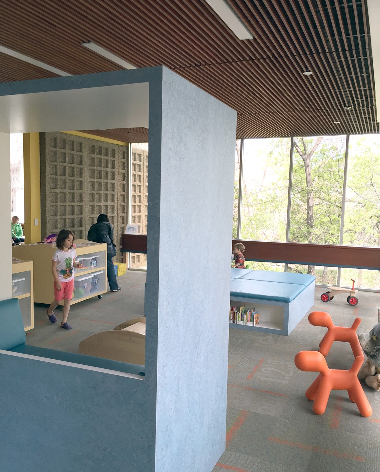


In an attempt to harness the individuality and playfulness of children we created undulating lines and placed them in a dynamic pattern that does not repeat. Playing off the ephemeral concept, we sought to reinforce the underlying permanence of nature itself (the clockwork changing of the seasons, the scientific structure of living things), while touching on its impermanence. By layering the patter in varying levels of transparency we illustrate its structured foundation while creating constantly changing display of color.


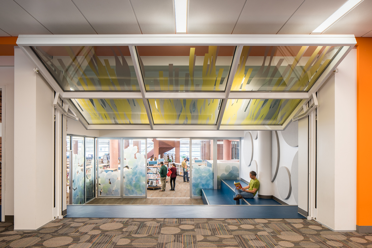
To create graphic consistency, reduce visual noise, and give wayfinding cues, we played off of the organic shape of a river rock which manifests in the shape of the acoustical panels found in the various meeting rooms. Playing with varying levels of transparency we start to see the relationships and connections that are made when one shape starts to interact with another. On a micro level, we start to see colors change as they are applied in thick layers and we see new shapes appear, illustrating the results of shared experience and interaction. On a macro level, we start to see how the collective creates a shoreline, giving safe harbors for outliers as they traverse the eddies looking for new experiences.


The teen space graphic plays off of honeycomb geometry which relates to a sense of community. The embossed texture of the pattern creates a dimorphic ripple to illustrate the emotive qualities the teens identified in their inReach. The sentiment was one of being caught between two worlds – pulled in a direction that is new and vast while desiring to stay in the comfort and safety of what is familiar. The transition between light and dark represents the known and unknown; the pop of yellow identify the individual.


Filter content by studio: